
Web Management Interface.
This section describes the features and functions of the Web Management interface for NetMon. You can use this interface to analyze network packet captures, check traffic statistics, view data logs, and change configuration options for the NetMon appliance.
You can launch the Web Management interface in Internet Explorer 11 or the most recent versions of Chrome and Firefox. (For login instructions and first-time setup, see Get Started with NetMon.) NetMon uses Kibana to present the data it collects. Kibana is an open-source analytics and visualization platform designed to work with Elasticsearch.
When you first log in to NetMon, the Analyze Dashboard appears. By default, this dashboard shows a histogram and pie chart of the top 10 applications on your network based on total bandwidth for the last 15 minutes, and a table showing the 500 most recent network flows.
Navigation
The top navigation bar provides access to the main areas of NetMon. From here, you can:
Click on a heading in the navigation bar to open another page.
Search for specific data using a Lucene query or Kibana Query Language (KQL) query.
View the data traffic in charts and graphs.
Clicking on an item from the top navigation bar opens another page or performs a task.
Main Pages in NetMon
Page | Function |
|---|---|
Analyze | Provides access to NetMon's standard and custom dashboards. |
Rules | Uploads, composes, and manages DPA rules. |
Replay | Uploads PCAPs for analysis in NetMon. |
Configuration | Provides controls and configuration options for fine-tuning NetMon and configuring packet captures. |
Diagnostics | Shows real-time statistics of network traffic. |
Logs | Shows real-time logs for NetMon activities. |
Kibana Sidebar
Icon | Name | Function |
|---|---|---|
 | Recently Viewed | Displays your most recent views, dashboards, and visualizations in NetMon. |
 | Discover | Loads the NetMon Discover page. |
 | Visualize | Loads the NetMon Visualize page |
 | Dashboard | Loads the Analyze Dashboard (default) or the last dashboard you accessed. |
 | Dev Tools | Opens a developer console to run requests in NetMon. |
 | Management | Provides access to advanced configuration settings for NetMon, including indices, index patterns, saved objects, UI settings, and more. These settings should only be changed by users with advanced knowledge of NetMon. |
Other Services on the Top Navigation Bar.
Icon | Name | Function |
|---|---|---|
 | Administration | Restarts, reboots, or shuts down NetMon. For more information, see Restart Services, Reboot, or Shut Down NetMon. |
 | User Options | Signs you out of your NetMon session. |
 | Help | Displays your NetMon license information, and provides access to the NetMon online Help, the LogRhythm Community forum, and the ability to download a diagnostics report. For more information, see Help. An internet connection is required for NetMon online help and community access. |
Some pages include a column of navigation tabs along the left side, which allow you to access another set of fields, charts, or commands.
Filter Configuration Pages
A Filter box appears at the top of many NetMon configuration pages. You can type in this box to quickly filter the number of configuration parameters that are displayed. As you start to type in the filter box, configuration parameters that do not match the filter are hidden. This functionality is useful for finding a specific parameter or pages that contain a large number of configuration options.
NetMon and Kibana
Kibana is an open-source analytics and visualization platform designed to work with Elasticsearch. NetMon uses Kibana to let you search, view, and interact with data stored in Elasticsearch indices. You can easily perform advanced data analysis and visualize your data in a variety of charts, tables, and maps.
With Kibana, NetMon makes it easy to understand large volumes of data. Its simple, browser-based interface enables you to quickly create dynamic dashboards that display changes to Elasticsearch queries in real time.
Data Discovery and Visualization
On NetMon's Discover page, you can submit search queries, filter the results, and examine the data in the returned documents. For example, you can get all sessions over SMTP that were sent to port 25 with the following query: Application:smtp and Destport:25.
The table is populated with the most recent records at the top. By default, the Discover page shows the first 500 entries that match the search criteria. Scrolling to the bottom of the page loads more results. You can change the time filter, interact with the histogram to drill down into the data, and view the details of particular documents. For more information about exploring your data from the Discover page, see Discover.
You can construct visualizations of your search results from the Visualize page. Each visualization is associated with a search. One of the available visualizations is Top 10 Destination Ports. The Y-axis shows counts by destination port. The X-axis shows the time range. This visualization helps you see port usage patterns over a particular time period, perhaps highlighting network bots or crawler activity during off hours.
You can save visualizations and combine them into dashboards to make it easy to correlate related information. For example, the Destination Port Dashboard helps you determine which destination ports you may want to examine in detail. This dashboard contains the following visualizations:
Top 10 Dest Ports (pie)
Top 10 Dest Ports (line)
Top 10 Dest Ports Data
Top 10 Dest Ports by Bandwidth (histogram)
Ports Table
For more information about creating and sharing visualizations and dashboards, see the Visualize and Dashboard topics.
Discover
You can use the Discover page to build tables as you submit search queries, filter the search results, and view document data. You can also see the number of documents that match any search query and get field value statistics. The distribution of documents over time appears in a histogram at the top of the page.
To access NetMon's Discover page, click the Discover icon on the Kibana sidebar.
Use the Discover page to explore data from every session analyzed by NetMon.
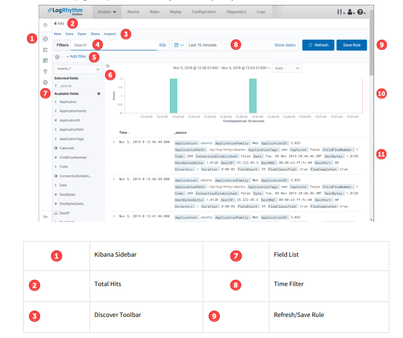

Set the Time Filter
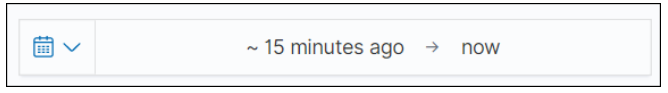
The Time Filter restricts the search results to a specific time period. By default, the time filter is set to the last 15 minutes. You can use the Time Picker to change the time filter or select a specific time interval or time range in the histogram at the top of the page.
To configure custom start and end dates in the Time Filter, click the Time Filter. You will see start and end periods separated by an arrow.
Use the following instructions to set a time filter with the Time Picker.
Set a Quick Filter
Click the Time Filter icon in the toolbar.
Configure the time interval under the Quick select header and click Apply, or click one of the shortcut links under the Commonly used or Recently used date ranges headers to use a previously configured time interval.
Set a Time Filter from the Histogram
Click the bar that represents the time interval you want to zoom in on, and then click Apply.
Click and drag to view a specific timespan. You must start the selection with the cursor over the background of the chart—the cursor changes to a plus sign when you hover over a valid start point.
You can use the browser's Back button to undo your changes.
The histogram lists the time range you are currently exploring, as well as the intervals that the range is currently using. To change the intervals, click the link and select an interval from the drop-down. The default behaviour automatically sets an interval based on the time range.
Search Your Data
You can search by submitting a query from the Discover page. You can enter simple query strings, use the Lucene query syntax, or use the full JSON-based Elasticsearch Query DSL.
When you submit a search, the histogram, Documents table, and Fields list are updated to reflect the search results. The total number of hits (matching documents) is shown in the upper-left corner of the page. The Documents table shows the first 500 hits. By default, the hits are listed in reverse chronological order, with the newest documents shown first.
You can reverse the sort order by clicking on the Time column header. You can also sort the table using the values in any indexed field.
To search your data:
Enter a query string in the Search field:
To perform a free text search, simply enter a text string. This searches all metadata that has been
analyzed by NetMon.To search for a value in a metadata field, prefix the value with the field name. For example, you could
enter Application:smtp to limit the results to SMTP traffic.To search for a range of values, you can use the bracketed range syntax, [START_VALUE TO END_VALUE]. For example, to find sessions with application IDs of 7xx, you could enter ApplicationID:[700 TO 799].
To specify more complex search criteria, you can use the Boolean operators AND, OR, and NOT. For
example, to find email messages containing an attachment, you could enter ApplicationTags:email AND Attach:true.
These examples use the Lucene query syntax. You can also submit queries using the Kibana Query Language (KQL). For examples, see query string syntax in the Elasticsearch Reference.
To submit your search query, press Enter.
Start a New Search
To clear the current search and start a new search, click New on the Discover toolbar.
Save a Search
You can reload saved searches on the Discover page and use them as the basis for visualizations. To save the current search:
Click Save on the Discover toolbar.
Enter a name for the search, and then click Confirm Save.
Open a Saved Search
To open a saved search:
Click Open on the Discover toolbar.
Select the search you want to load.
Share a Search
To share a search:
Click Share on the Discover toolbar.
Select whether to share the search as a snapshot (which encodes the current state of the URL) or a saved object (which lets users load the most recent saved version of the search).
You cannot share the link as a saved object unless the search has been saved.
(Optional) To shorten the search URL, click the Short URL toggle. Shortening the URL helps avoid compatibility issues with certain browsers and text editors.
Click Copy link.
Inspect a Search
This function queries Elasticsearch to fetch information on your search. To inspect a search, click Inspect on the Discover toolbar.
Automatically Refresh the Page
You can configure a refresh interval to automatically refresh the page with the latest index data. This periodically resubmits the search query.
When a refresh interval is set, it appears in the time filter.
To set the refresh interval:
Click the Time Filter icon.
Under the Quick select header, set a refresh interval. 2
Click Apply.
To automatically refresh the data:
Under the Refresh every header, select an auto-refresh interval.
Click Start.
When auto-refresh is enabled, the time filter icon changes to a clock.To stop auto-refresh, click Stop.
Filter by Field
You can filter the search results to display only those documents that contain a particular value in a field. You can also create negative filters that exclude documents that contain the specified field value.
You can add filters from the search bar, the fields list, or the Documents table. When you add a filter, it appears in the filter bar below the search bar. From the filter bar, you can enable or disable a filter, invert the filter (change it from a positive filter to a negative filter or a negative to a positive), toggle the filter on or off, or remove it entirely. To collapse the list, click the Filters box next to the search bar.
Add a Filter from the Search Bar
Click the Filters box next to the search bar.
Click Add filter.
Select a Field, select an Operator, and then enter a value in the Value field.
(Optional) Click the Create custom label? slider on or off.
Click Save.
The filter appears under the search bar.
Add a Filter from the Fields List
Click the name of the field you want to filter on. This displays the top five values for that field. To the right of each value, there are two magnifying glass buttons—one for adding a regular (positive) filter, and one for adding a negative filter.
To add a positive filter, click the Positive Filter button. A positive filter includes only documents that contain that value in the field.
To add a negative filter, click the Negative Filter button. A negative filter excludes any documents that contain that value in the field.
The filter appears under the search bar.
Add a Filter from the Documents Table
Expand a document in the Documents table by clicking the Expand button to the left of the document’s entry in the first column (the first column is usually Time). To the right of each field name, there are two magnifying glass buttons—one for adding a regular (positive) filter, and one for adding a negative filter.
To add a positive filter based on the document’s value in a field, click the Positive Filter button. A positive filter includes only documents that contain the specified value in that field.
To add a negative filter based on the document’s value in a field, click the Negative Filter button. A negative filter excludes any documents that contain the specified value in that field.
The filter appears under the search bar.
Work with Filters
When you create a filter anywhere in NetMon, the filter conditions display in a box under the search bar. The number of active filters appears on the right side of the Filters box.
Clicking on a filter box displays the following options:
Pin across all apps
Click this option to pin the filter across all tabs in NetMon, ensuring they remain in place for different visualizations and dashboards. You can unpin the filter by clicking the icon (which now says "Unpin") again.
Edit filter
Click this option to edit a filter. For more information, see Filter by Field.
Exclude results
Click this option to exclude results from the current view. You can toggle this setting back to include by clicking the icon (which now says "Include filters") again.
Temporarily disable
Click this option to disable the filter without removing it. You can enable a disabled filter by clicking the icon (which now says "Re-enable") again.
Delete
Click this option to remove a filter entirely.
View Document Data
When you submit a search query, the 500 most recent documents that match the query are listed in the Documents table. You can add fields to the Documents table from the Fields list. You can sort the listed documents by any indexed field that’s included in the table.
To view a document’s field data, click the Expand icon to the left of the document’s entry in the Time
column. NetMon reads the document data from Elasticsearch and displays the document fields in a table.
To view the original JSON document (pretty-printed), click the JSON tab.
To view document data in the context of newer and older documents, click View surrounding documents.
To view the document data as a separate page, click View single document.
To collapse the document details, click the Collapse icon.
Hover over a metadata row to see filter buttons and field values.

Add Field Columns to the Documents Table
By default, the Documents table shows the localized version of the time field and the document source. You can add fields to the table from the Fields list or from a document’s expanded view.
Add a Field from the Fields List
Hover over a field in the Fields list that you want to add, and then click add.
Repeat until you’ve added all the fields you want to display in the Documents table.
Add a Field from the Documents Table
In the Documents table, hover over the field you want to add, and then click the Toggle column in table button.
The added field columns replace the _source column in the Documents table. The added fields are also listed in the Selected Fields section at the top of the field list.To rearrange the field columns in the table, point to the header of the column you want to move, and then click the Move button (<< or >>).
Remove Field Columns from the Documents Table
To remove field columns from the Documents table:
Hover over the field you want to remove, and then click its remove X button.
Repeat until you’ve removed all the fields you want to drop from the Documents table.
View Field Data Statistics
From the Fields list, you can see how many documents in the Documents table contain a particular field, what the top five values are, and what percentage of documents contain each value.
To view field data statistics, click the name of a field in the Fields list. The field can be anywhere in the Fields list:
Selected Fields or Available Fields.
Visualize
You can use the Visualize page to design data visualizations. You can save these visualizations, use them individually, or combine visualizations into a dashboard.
A visualization can be based on one of the following data source types:
A new interactive search
A saved search
An existing saved visualization
Visualizations are based on the aggregation feature introduced in Elasticsearch 1.x.
Create a New Visualization
Click the Visualize icon on the Kibana sidebar.
To start the New Visualization wizard, click Create new visualization. The wizard guides you through the following steps:
Step 1: Choose the Visualization Type
Choose a visualization type when you start the New Visualization wizard. You can choose from the following visualizations:
|
|
For more information about these Kibana visualizations, please see https://www.elastic.co/guide/en/kibana/7.2/ visualize.html.
You can also load a saved visualization that you created earlier. The saved visualization selector includes a text field to filter by visualization name and a link to the Object Editor, accessible through the Settings page, to manage your saved visualizations.
If your new visualization is a Markdown widget, selecting that type takes you to a text entry field where you enter the text to display in the widget. For all other types of visualization, selecting the type takes you to data source selection.
Step 2: Choose a Data Source
You can choose a new or saved search to serve as the data source for your visualization. When you create a visualization from a saved search and save the visualization, the search is tied to the visualization. When you make changes to the search that is linked to the visualization, the visualization updates automatically.
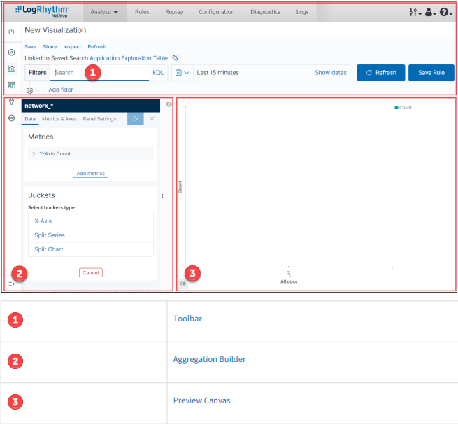
Step 3: The Visualization Editor
The visualization editor enables you to configure and edit visualizations. The visualization editor has the following main elements:
Automatically Refresh the Page
You can configure a refresh interval to automatically refresh the page with the latest index data. This periodically resubmits the search query.
When a refresh interval is set, it appears in the time filter.
To set the refresh interval:
Click the Time Filter icon.
Under the Quick select header, set a refresh interval.
Click Apply.
To automatically refresh the data:
Under the Refresh every header, select an auto-refresh interval.
Click Start.
When auto-refresh is enabled, the time filter icon changes to a clock icon.To stop auto-refresh, click Stop.
Toolbar
The toolbar has a search field for interactive data searches, as well as controls to manage saving and loading visualizations. You can edit the search in the search bar.
The toolbar above the search bar has buttons for saving, sharing, inspecting, and refreshing the current visualization.
Aggregation Builder
Use the aggregation builder on the left of the page to configure the metric and bucket aggregations used in your visualization. Buckets are analogous to SQL GROUP BY statements. For more information on aggregations, see the main Elasticsearch aggregations reference.
Bar, line, or area chart visualizations use metrics for the Y-axis and buckets for the X-axis, segment bar colors, and row/ column splits. For pie charts, use the metric for the slice size and the bucket for the number of slices.
Choose the metric aggregation for your visualization’s Y-axis, such as count, average, sum, min, max, or cardinality (unique count). Use bucket aggregations for the visualization’s X-axis, color slices, and row/column splits. Common bucket aggregations include date histogram, range, terms, filters, and significant terms.
You can set the order in which buckets execute. In Elasticsearch, the first aggregation determines the data set for any subsequent aggregations. The following example involves a date bar chart of Web page hits for the top five file extensions.
To use the same extension across all hits, set this order:
Color: Terms aggregation of extensions
X-Axis: Date bar chart of @timestamp
Elasticsearch collects the records for the top five extensions and then creates a date bar chart for each extension.
To chart the top five extensions for each hour, use the following order:
X-Axis: Date bar chart of @timestamp (with one-hour interval)
Color: Terms aggregation of extensions
For these requests, Elasticsearch creates a date bar chart from all the records and then groups the top five extensions inside each bucket, which in this example is a one-hour interval.
Each subsequent bucket slices the data from the previous bucket.
To render the visualization on the preview canvas, click the green Apply Changes button at the top right of the Aggregation Builder.
You can learn more about aggregation and how altering the order of aggregations affects your visualizations here.
Work with Filters
When you create a filter anywhere in NetMon, the filter conditions display in a box under the search bar. The number of active filters appears on the right side of the Filters box.
Clicking on a filter box displays the following options:
Pin across all apps
Click this option to pin the filter across all tabs in NetMon, ensuring they remain in place for different visualizations and dashboards. You can unpin the filter by clicking the icon (which now says "Unpin") again.
Edit filter
Click this option to edit a filter. For more information, see Filter by Field.
Exclude results
Click this option to exclude results from the current view. You can toggle this setting back to include by clicking the icon (which now says "Include filters") again.
Temporarily disable
Click this option to disable the filter without removing it. You can enable a disabled filter by clicking the icon (which now says "Re-enable") again.
Delete
Click this option to remove a filter entirely.
Preview Canvas
The preview canvas displays a preview of the visualization you’ve defined in the aggregation builder. To refresh the visualization preview, click the Refresh button on the toolbar.
Dashboard
A dashboard displays a set of saved visualizations in groups that you can arrange freely. You can save a dashboard to reload at a later time. The Analyze tab of the Web Management interface contains preloaded dashboards and your custom dashboards (after you create them).
Automatically Refresh the Page
You can configure a refresh interval to automatically refresh the page with the latest index data. This periodically resubmits the search query.
When a refresh interval is set, it appears in the time filter.
To set the refresh interval:
Click the Time Filter icon.
Under the Quick select header, set a refresh interval.
Click Apply.
To automatically refresh the data:
Under the Refresh every header, select an auto-refresh interval.
Click Start.
When auto-refresh is enabled, the time filter icon changes to a clock.To stop auto-refresh, click Stop.
Create a New Dashboard
Click the Dashboard icon on the Kibana sidebar.
Click Create new dashboard.
Follow the prompts in the NetMon UI.
Add Visualizations to a Dashboard
Click Add on the toolbar panel and select one or more saved visualization from the list. You can filter the list of visualizations by typing a filter string into the Add panels search bar.
Click Create new visualization.
Select a visualization. For more information, see Visualize.
Select an area or source to apply to the visualization.
The visualization you select appears in a container on your dashboard.
If you see a message about the container's height or width being too small, resize the container.
Save Dashboards
Click Edit on the toolbar panel, and then click Save.
Enter a name for the dashboard in the Title field, and then click Confirm save.
(Optional) By default, dashboards store the time period specified in the time filter when you save a dashboard.
To disable this behavior, clear the Store time with dashboard box before saving.
Load a Saved Dashboard
To load a saved dashboard, either click Analyze on the top navigation bar of the Web Management interface and select a dashboard, or click the Dashboard icon on the Kibana sidebar to display a list of existing dashboards. The saved dashboard selector includes a text field to filter by dashboard name and a link to edit each dashboard.
The following system dashboards are available in NetMon:
Dashboard | |
|---|---|
Alarm Trend | Detailed information about number of alarms fired and which applications triggered alarms, useful for viewing alarm metrics at a glance. |
Alarms | Alarms that have triggered during the selected time interval. |
Analyze | Top application flows during the selected time interval |
Application Exploration | Top application flows during the selected time interval, sorted by application family and application tag. For more information, see Application Families and Tags. |
Capture | Sessions captured during the selected time interval. |
Destination Port | Top destination ports identified during the selected time interval. |
File Reconstruction | Metadata from file attachments downloaded from captured sessions. |
Ingress Egress Traffic | Ingress and egress traffic identified during the selected time interval. This dashboard requires the Flow_IdentifyTrafficDirection system DPA rule. |
Network Analysis | Visualizations that present bandwidth of various applications, overall bandwidth, traffic direction, and system intercommunication. |
Network Node Link | Information about the traffic between source and dest IPs on the network, including a Node Link Graph visualization of the top endpoints by bandwidth |
Replayed Traffic | PCAPs uploaded to NetMon and replayed. |
SMB | Visualizations containing detailed information about the SMB traffic profile, including metadata fields such as SMB versions, paths, command strings, and operating systems, as well as which systems are involved in SMB sessions. |
SMTP Trends | Metadata around email use during the selected time interval. |
Top Level Domain | Metadata around top-level, second-level, and Fully Qualified Domain Name (FQDN) traffic identified during the selected time interval. This dashboard requires the Flow_TopLevelDomain system DPA rule. |
Traffic Endpoints | Source and destination IP addresses identified during the selected time interval, sorted by metadata impact. |
Traffic Profile | Application-centric view of metadata impact during the selected time interval. |
Customize Dashboard Elements
The visualizations in your dashboard are stored in resizable containers that you can arrange on the dashboard. This section discusses customizing these containers.
These options only apply to custom dashboards. You cannot move, remove, or resize dashboards that come preloaded in NetMon.
Move Containers
Click and hold a container’s header to move the container around the dashboard. Other containers shift as needed to make room for the moving container. Release the mouse button to confirm the container’s new location.
Resize Containers
Move the cursor to the bottom right corner of the container until the cursor changes to point at the corner. After the cursor changes, click and drag the corner of the container to change the container’s size. Release the mouse button to confirm the new container size.
Delete Containers
Click the Settings icon at the top-right corner of a container, and then click Delete from dashboard.
Removing a container from a dashboard does not delete the saved visualization in that container.
View Detailed Information
To display the raw data behind the visualization, click the Settings icon at the top-right corner of a container, and then click Inspect. Detailed information about the raw data replaces the visualization.
To see a representation of the underlying data, presented as a paginated data grid, click View: Data in the top-right corner of the Inspect screen. You can sort the items in the table by clicking on the table headers at the top of each column.
To export the raw data behind the visualization as a comma-separated-values (.csv) file, click Download CSV, and then select either the Formatted CSV or Raw CSV. A raw export contains the data as it is stored in Elasticsearch. A formatted export contains the results of any applicable field formatters.
To view Requests, click View: Requests in the top-right corner of the Inspect screen. A request that queries Elasticsearch to fetch the data for the visualization.
Statistics
A summary of the statistics related to the request and the response, presented as a data grid. The data grid includes the query duration, the request duration, the total number of records found on the server, and the index pattern used to make the query.
To see this data, click the Statistics header.
Request
The raw request used to query the server, presented in JSON format.
To see this data, click the Request header.
Response
The raw response from the server, presented in JSON format.
To see this data, click the Response header.
Change the Visualization
From the menu above the search bar, click Edit and make your changes.
Work with Filters
When you create a filter anywhere in NetMon, the filter conditions display in a box under the search bar. The number of active filters appears on the right side of the Filters box.
Clicking on a filter box displays the following options:
Pin across all apps
Click this option to pin the filter across all tabs in NetMon, ensuring they remain in place for different visualizations and dashboards. You can unpin the filter by clicking the icon (which now says "Unpin") again.
Edit filter
Click this option to edit a filter. For more information, see Filter by Field.
Exclude results
Click this option to exclude results from the current view. You can toggle this setting back to include by clicking the icon (which now says "Include filters") again.
Temporarily disable
Click this option to disable the filter without removing it. You can enable a disabled filter by clicking the icon (which now says "Re-enable") again.
Delete
Click this option to remove a filter entirely.
Preview Canvas
The preview canvas displays a preview of the visualization you’ve defined in the aggregation builder. To refresh the visualization preview, click the Refresh button on the toolbar.
Switch Between Light and Dark Modes
NetMon includes light and dark UI display modes to accommodate different visibility needs and user preferences.
To switch between light and dark modes:
On the Kibana sidebar, click the Management icon.
Click Advanced Settings.
On the General panel, scroll to the Dark mode setting and click the toggle switch to On.
Click Save.
Reload the page for the changes to take effect.
The NetMon Web Management interface displays in dark mode.
Help
The Help menu allows you to easily view version and licensing information about your NetMon, access NetMon documentation, connect with NetMon users and LogRhythm developers via the LogRhythm Community, or download logs and other information about your system and network.
On the top navigation bar, click the Help icon to open the drop-down menu.
Select one of the following options:
Option | Function |
|---|---|
About NetMon | Opens the System Details page and the End User License Agreement. |
NetMon Help | Opens the NetMon online Help in a new browser tab. An internet connection is required to view NetMon online Help. |
NetMon Forum | Opens the NetMon forum in the LogRhythm Community in a new browser tab. |
Download Diagnostics | Downloads a .zip file of collected logs, system information, usage information, network metadata, and payload information regarding the system and current network traffic. To download a .zip file designed to help LogRhythm Support diagnose and troubleshoot issues with a NetMon deployment, click Download Diagnostics Package. It may take several minutes to assemble and download the .zip file through your browser. The .zip file contains the following
|