Threat Activity Map
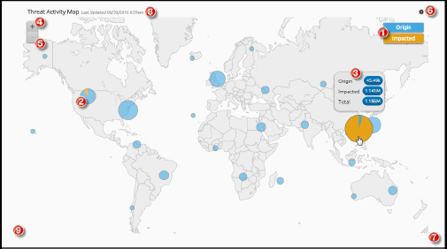
The Threat Activity Map widget provides instant visibility into the geographical origin of log data in your deployment as well as visibility into which locations are impacted by log data in your deployment. The Threat Activity Map widget provides analysts with a starting point for investigating areas of the world that appear to have activities of interest.
To ensure that the Threat Activity Map widget is working properly, you must enable the GeoLocation IP resolver on all of your Data Processors. To enable GeoLocation, set the GeoIPResolutionMode property to Country, Region, or City in the Data Processor Advanced Properties. The City level provides the most detailed information. For more information, see Data Processor in the Client Console (Administrator's Guide).
For more information on what to do if the Threat Activity Map widget is not properly displaying data, see Troubleshoot Threat Activity Map.
The Threat Activity Map widget displays log data containing location metadata. Any dashboard-level filters do not apply to the Threat Activity Map.
Understand the Threat Activity Map Widget
The Threat Activity Map widget is displayed and managed through the Threat Activity Map widget widget, which automatically appears in the widget menu on the Dashboards page for all Global Administrators and Global Analysts. For more information about adding widgets to dashboards, see Add Widgets.

The widget's minimum size is 3 columns by 2 rows, but it can be expanded to take up a larger area. For more information on resizing widgets, see Resize Widgets.
The Threat Activity Map widget plots the volume of events occurring in the environment based on the location data available in the Data Indexer. The map performs live updates and adjusts the plotted points based on new logs entering the Data Indexer.
Your Threat Activity Map widget only shows events from live clusters. If one or more clusters in your deployment goes down, data from those clusters are no longer represented in your Threat Activity Map widget and a status indicator appears in the Inspector panel. The time stamp at the top of the widget shows the date and time that the map was last updated.
Understand Nodes
The nodes in the Threat Activity Map widget widget represent events happening in your environment around the world. Nodes on the map change size based on the relative volume of events in each location. Areas with more events have larger nodes.
Nodes are automatically aggregated by the proximity of activities. The aggregation of data in a node is not always aggregated at the country/region/city level. For example, if there is activity in France, The Netherlands, Belgium, and Germany, a single node may represent the data for all of these areas when the map is zoomed out.
When you zoom in, the log data for a larger node is split into smaller nodes to show more specific locations where threat activity is occurring.
Understand Origin vs. Impacted Displays
Nodes appear as pie charts and give a visual indication of how many times the location contained the origin of activity and/or how many times it was the impacted location. You can configure the nodes to show only origin, only impacted, or origin and impacted information.
To see a breakdown of the types of events represented by the pie chart, hover over the node. For more specific information about threat activity, you must drill down to see the specific log data.
